
Homepage rebrand
Our Challenge
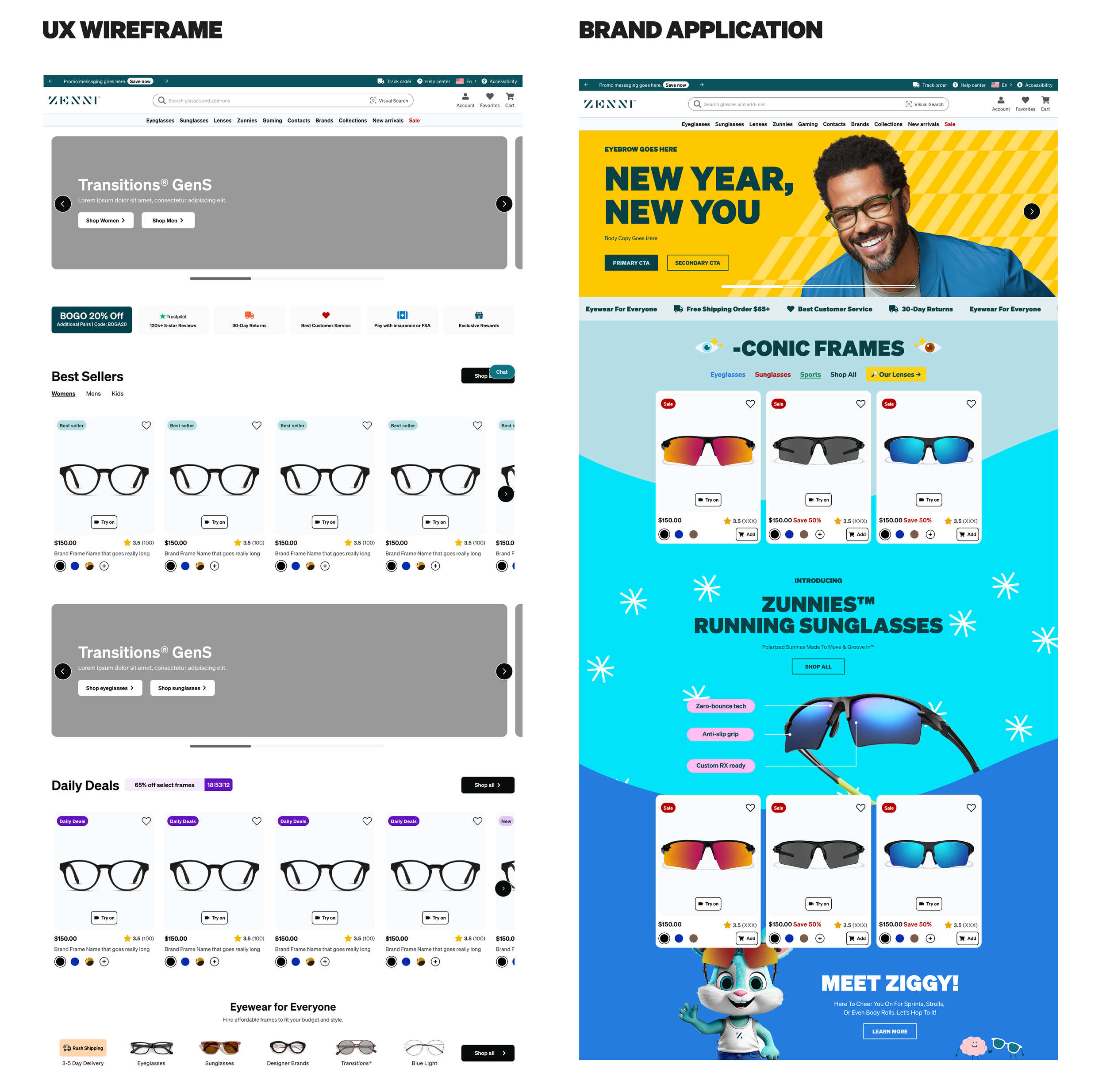
The organization had undergone a significant rebrand, necessitating a complete overhaul of the digital experience, starting with the homepage. This initiative was part of a broader, critical company goal to eliminate technical debt by migrating to Next.js and establishing a robust, reusable component library in Storybook. The core constraint was an extremely tight timeline: December start planning for a February launch.
The Opportunity
We identified an opportunity to move beyond a simple reskin and leverage the technical initiative to solve a significant user trust and internal efficiency problem. By building a consistent design system, we could address the lack of user trust caused by the fragmented, inconsistent look and feel across different pages and campaign launches. Success would also unlock massive Engineering and Design efficiency gains.
The Problem
Problem Statement: Users want to be confident that Zenni can be trusted, but as the site look and feel is fragmented within stages of the flow, users tend to second guess where they are.
Validation: Inconsistent UI fragments the brand experience, eroding user confidence and making content discovery challenging.
Key Metric: Click-Through Rate (CTR) on the homepage.
Approach
As the Director of Product Design, my strategy focused on accelerated cross-functional collaboration and design system governance to meet the constraints:
Executive Alignment: We maintained strict alignment by presenting to the Executive Leadership Team, VP of Brand, and ultimately the CEO for final strategic approval.
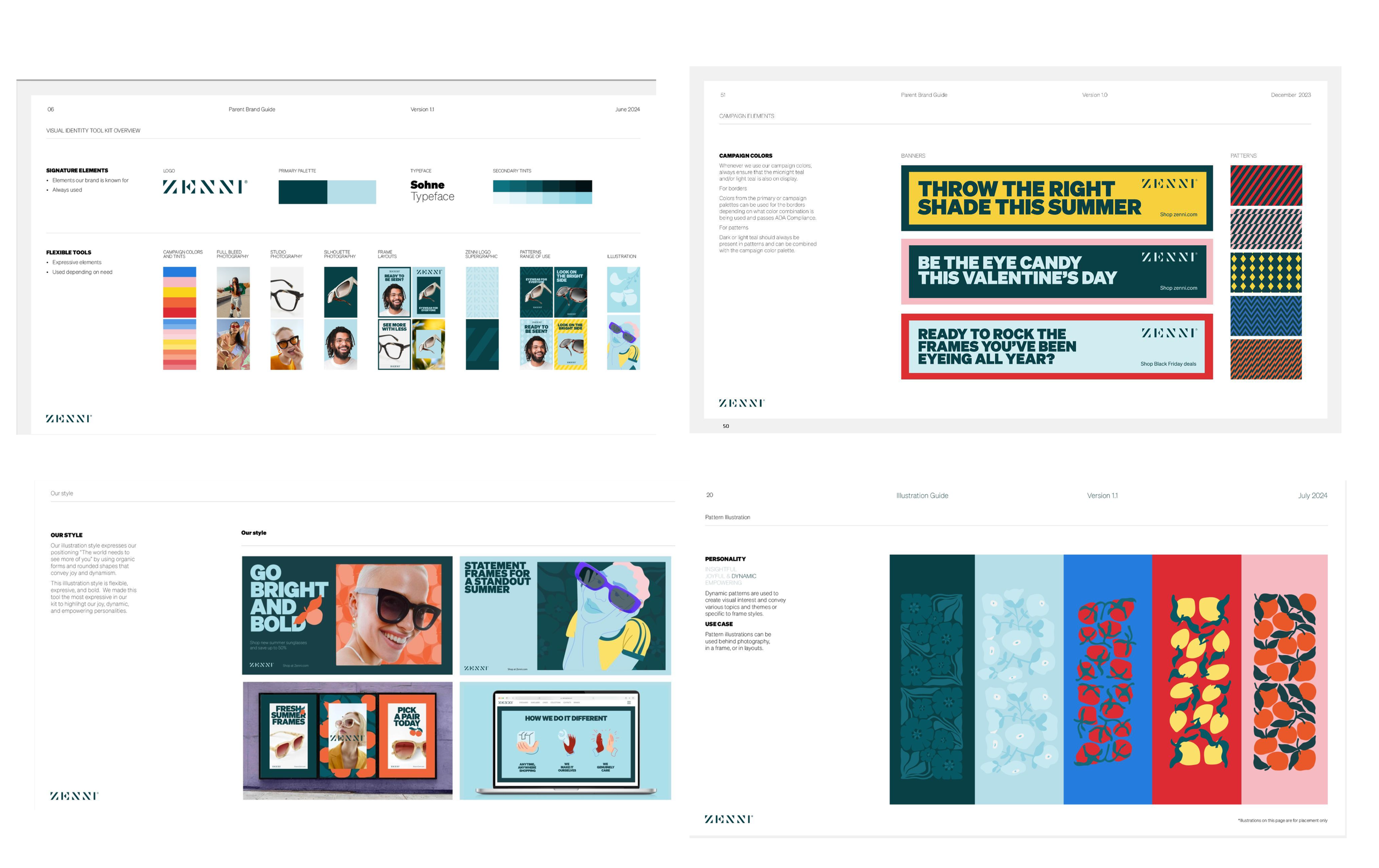
Collaborative Workshops: I formed a core team to host weekly workshops with the Creative team. Instead of traditional handoffs, this approach ensured both teams collaboratively applied the new brand guidelines (fonts, colors, patterns) to components from the start.
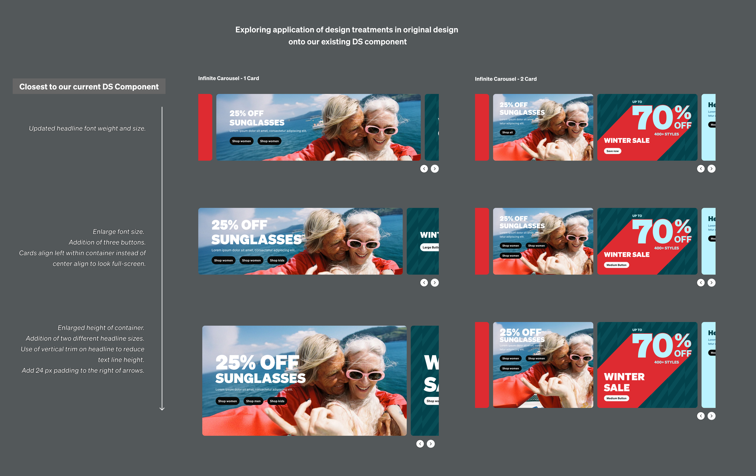
Parallel Work Streams: The UX and Creative teams flushed out design options while the Design Systems team simultaneously worked to identify how components would be updated and documented to ensure the development team was set up for immediate success (Storybook readiness).
Strategic Flexibility: We incorporated flexibility into the design system early, ensuring the new styles could accommodate the Creative team's need for diverse campaign expressions while still adhering to system rules.
-
![]()
Explore more
-
![]()
Have fun with it.
-
![]()
Zennity
-
![]()
Scale it

Solutions
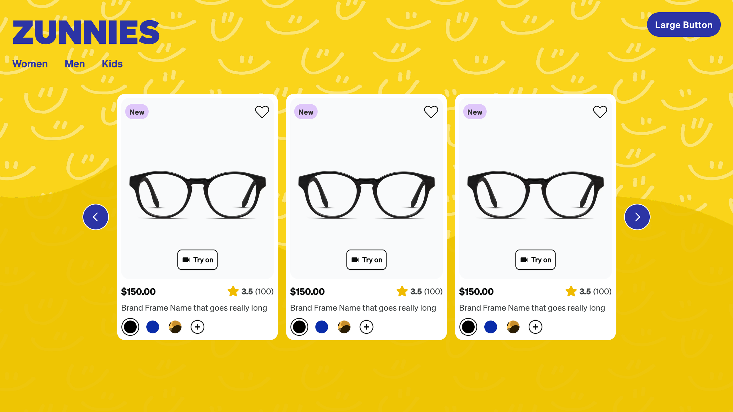
We delivered a fully redesigned, component-driven homepage, successfully applying the new brand identity.
Aesthetic & Trust: Implemented the new brand style guide and a brand-new font family to immediately establish a unified, trustworthy appearance.
Discoverability: Improved mobile design usability for better content discoverability, and reintroduced features like two- and three-tile component layouts.
Component Library: The new design system introduced 4 new components and updated existing ones, all built for reusability. Crucially, these components included flexible features such as:
The ability to host video content.
Toggles for turning text options and logos on/off.
Scalable content visibility (e.g., carousels auto-scrolling, containing 1-3 visible tiles).
Results
The redesign delivered a powerful, immediate uplift in core engagement metrics. Comparing the three months post-launch (April–July 2025) to the three months
pre-launch (November 2024–January 2025), the new homepage successfully:
Page Comparison Tool Content Square (directional)
Increased Conversion by 54.6%.
Increased Average Lifetime Revenue by 61.6%.
Reduced the Bounce Rate by 29.7% and the Exit Rate by 40%, indicating a much more trustworthy and engaging user entry point.
Increased View/Session by 4.90% and Time Spent on Page by 2.3%, showing users were more effectively discovering content.
This project directly advanced customer retention, engagement, and future revenue growth by establishing a trusted, consistent brand experience that drove users deeper into the funnel.
Key Learnings
This project provided crucial strategic lessons that now govern our design and development methodology:
Value of Collaborative Workshops: The single biggest lesson was how successful outcomes are when teams work together in workshops versus relying on sequential handoffs. This approach fostered deep understanding and shared ownership.
Strategic Time Investment: If I could rewind, I would adjust the timeline to allocate more space for application and comprehensive testing. This would have allowed for earlier identification and mitigation of stylistic tensions between campaigns and the new system.
Cross-Functional Synthesis: The Product Design team is now much closer to the Creative team, and the Creative team gained a deeper understanding of component architecture from the design team, creating a more symbiotic relationship for future projects.
Next Strategic Step: The long-term implication is a need for ongoing investment in brand governance and component standards to ensure campaigns continue to complement the core brand (working as a suite) and do not fall back into stylistic competition.