Compass Design System
Overview
The Design Systems Initiative is a company-wide effort to strengthen our product foundations through scalable systems, shared principles, and design automation. This initiative aligned directly with our 2024 OKR to “strengthen our foundations,” accelerating design velocity, deepening design–engineering collaboration, and enabling consistent, accessible experiences across global products.
The Challenge
Before the Design Systems Initiative, our product experience had become increasingly fragmented.
Our outdated UI kit led to widespread inconsistencies within the design team, which in turn surfaced across the customer experience. Designers were spending up to 4x longer creating layouts due to missing or mismatched components, and engineering lacked a reliable source of truth to build from.
This lack of a shared foundation created real business consequences:
Customers lost confidence in our brand due to inconsistent interfaces and interaction patterns.
Our velocity slowed, putting us behind on key feature launches.
Teams across global markets operated independently, making it impossible to scale design efficiently or maintain a unified experience.
The organization needed more than a design refresh — it required a systemic approach to unify design, engineering, and brand under a single, scalable design language.
The Approach
In 2024, our company’s OKR was to strengthen our foundations — to build the systems, tools, and processes that would allow us to operate with greater speed, consistency, and impact. The Design Systems Initiative became a cornerstone of that goal.
Partnering closely with the Design and Frontend Engineering teams, I led the definition of a unified design vision centered on three core values: Accessibility, Simplicity, and Customer-Centricity. These values evolved into guiding principles that shaped both our system architecture and our culture of collaboration.
Accessibility “Open gates, clear pathways.”
We designed our system to be open and participatory, ensuring that every contributor — from designers to engineers — could engage with clarity and confidence. Accessibility guided not just our UI patterns, but how we shared knowledge and collaborated.
Simplicity — “Feed two birds with one scone.”
We prioritized consolidation over complexity, seeking opportunities to streamline workflows and reduce redundancy. This mindset empowered teams to move faster by translating complex design challenges into understandable, reusable solutions.
Customer-Centricity — “Stay curious.”
We fostered a culture of curiosity and continuous learning — encouraging teams to ask questions, validate assumptions, and leverage research and data. Every design decision was anchored in the real needs of our customers, internally and externally.
Building blocks to components
Atoms to Templates
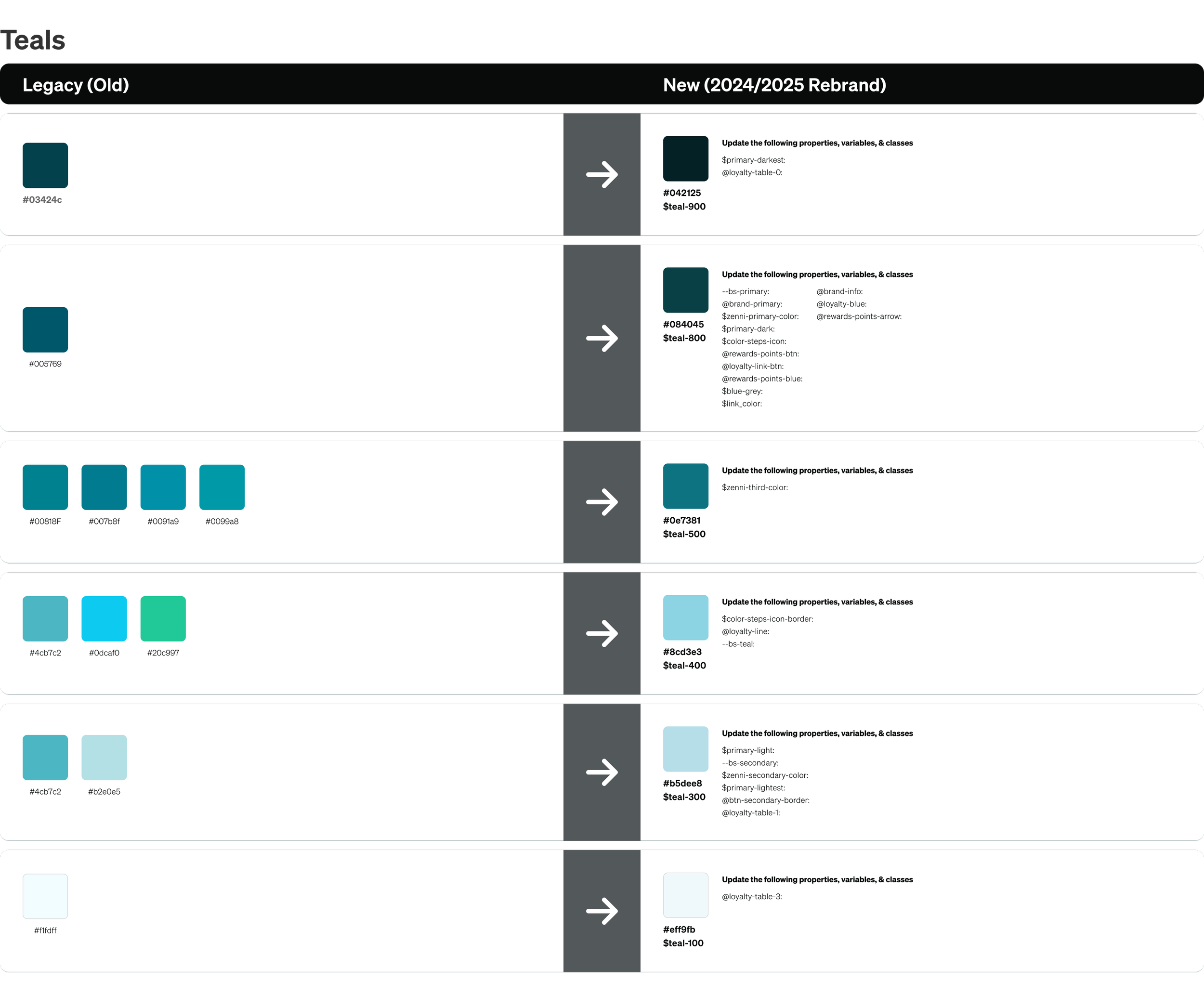
Typography
Color
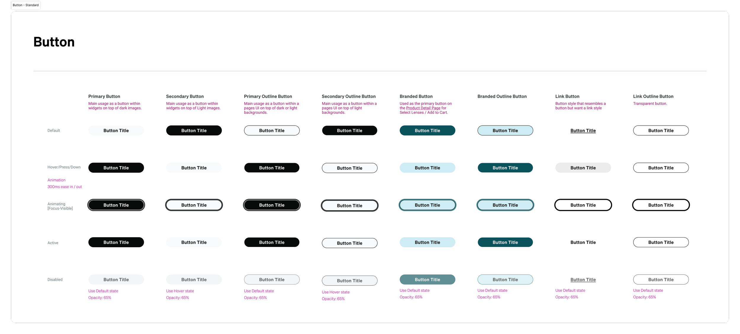
Buttons
Tiles
Patterns
Templates

Standard Figma Documenation
UI Kit Page Overview
Elements
Patterns
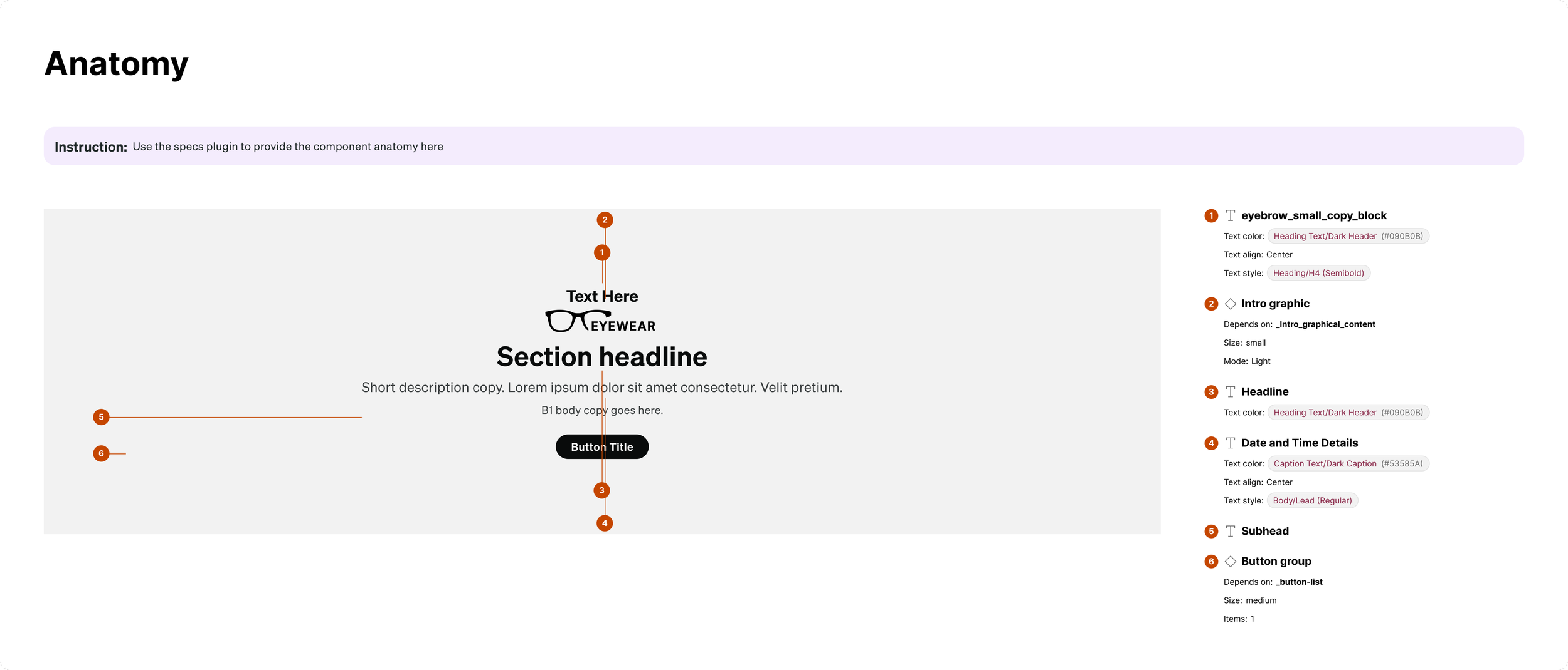
Anatomy
Responsive Behavior
Configuration
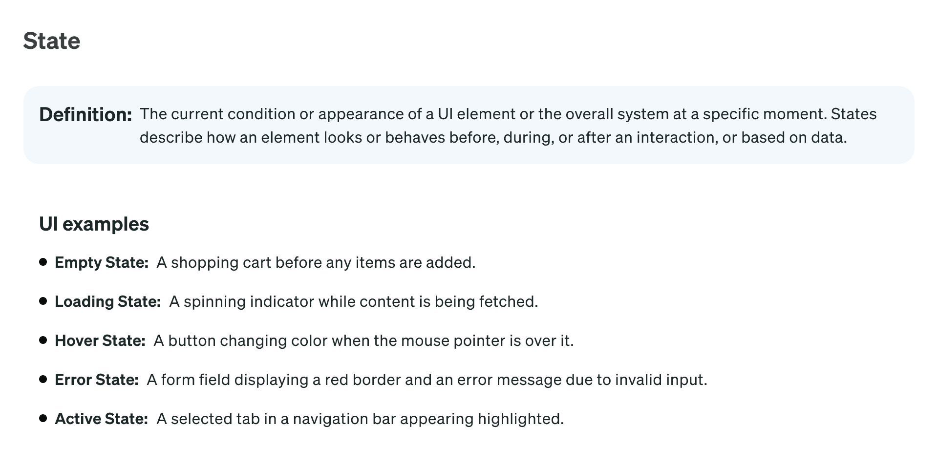
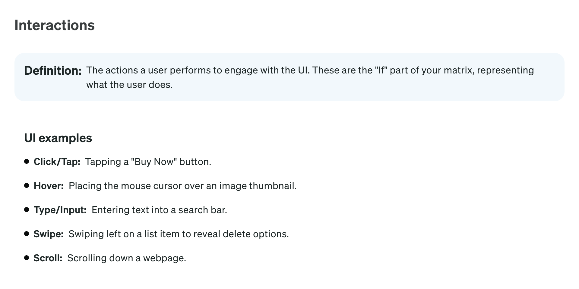
If-Then
Configuration Charts
Requirement Charts

The Impact
The Design Systems Initiative quickly became one of the most transformative efforts in strengthening our company’s product foundations.
By unifying design and development workflows, we achieved measurable gains in both speed and cross-functional efficiency.
Design velocity increased by up to 4x — the time required to create a landing page dropped from 1–3 hours to just 15–30 minutes.
Collaboration between design and frontend engineering deepened, with shared ownership of components and improved design-to-code handoffs.
A new UI kit modernized our design foundation, providing a consistent, flexible, and reusable set of components across all platforms.
A centralized Storybook library of components served as a single source of truth for designers and developers, enabling rapid prototyping, smoother handoffs, and consistent UI patterns.
The mobile team’s migration to React Native leveraged the new UI kit and Storybook library, along with AI-powered generation tools, saving the team months of coding and rework.
Beyond efficiency, the initiative established a new culture of shared ownership and scalability — enabling design and engineering to deliver faster, more consistent, and more accessible experiences across platforms.
Key Learnings
Leading the Design Systems Initiative reinforced a core belief: automation drives velocity, and velocity enables innovation. Foundational work like this often sits behind the scenes — it may not directly generate revenue, but it’s what allows a company to scale, mature, and move faster toward its goals.
This experience deepened my understanding of design leadership as a strategic discipline — one that balances long-term infrastructure investments with immediate business needs. Aligning design vision with organizational priorities not only accelerated product delivery, but also strengthened design’s credibility as a driver of operational excellence and growth.