Product Discovery Filter Menu
Our Challenge
Streamline navigation and spotlight the product catalog by making filters more visible, relevant, and intuitive.
The goal was to reduce cognitive load, simplify exploration, and empower users to make confident purchase decisions faster.
By surfacing the most meaningful filter options upfront, we aimed to help users refine their searches efficiently—improving both engagement and conversion.
The Opportunity
Our analysis revealed that users were underutilizing the existing filters due to hidden dropdowns and poor discoverability.
By removing dropdowns and displaying filters by default, we hypothesized that:
Users would engage more frequently with filters.
Increased filter interaction would lead directly to higher conversion and revenue.
Improving this single point of friction had the potential to create a compounding effect on the path-to-purchase across our entire catalog.

The Problem
Despite being a critical discovery tool, the old filter design was non-intuitive and slow:
Users had to click open each dropdown individually, which interrupted flow.
Filters lacked clear feedback states (e.g., how many results matched).
The design failed to support new, context-aware filters users expected (like size or dual PD).
These friction points led to higher bounce rates and missed opportunities for conversion.
The usability gap was clear: the interface wasn’t helping users refine or discover products with confidence.
Design Solution
We reimagined the filtering experience around accessibility, relevance, and responsiveness.
Key UX/UI improvements included:
Eliminating dropdowns and surfacing filters directly on the page for immediate access.
Redesigning the information architecture for logical category grouping.
Introducing checkboxes instead of outlines for more intuitive selection.
Adding feedback indicators, such as result counts and “clear all” actions, for better control.
Redesigning key filters (like Size and PD) to accommodate real user behaviors.
Our “launch and learn” philosophy allowed us to move fast, measure real-world performance, and iterate quickly with engineering support.
OUTCOME AT A GLANCE
💵 +$14.3M annualized revenue (vs. $7.2M projected)
📈 $1.6M uplift in just 31 days post-launch
🔍 Higher engagement with filter interactions and improved path to purchase
⚡ Reduced bounce rate and faster product discovery
🧩 Filters evolved from low-use to high-value tools in the customer journey
Impact
After launch, the redesigned filters delivered a measurable increase in user engagement and conversion:
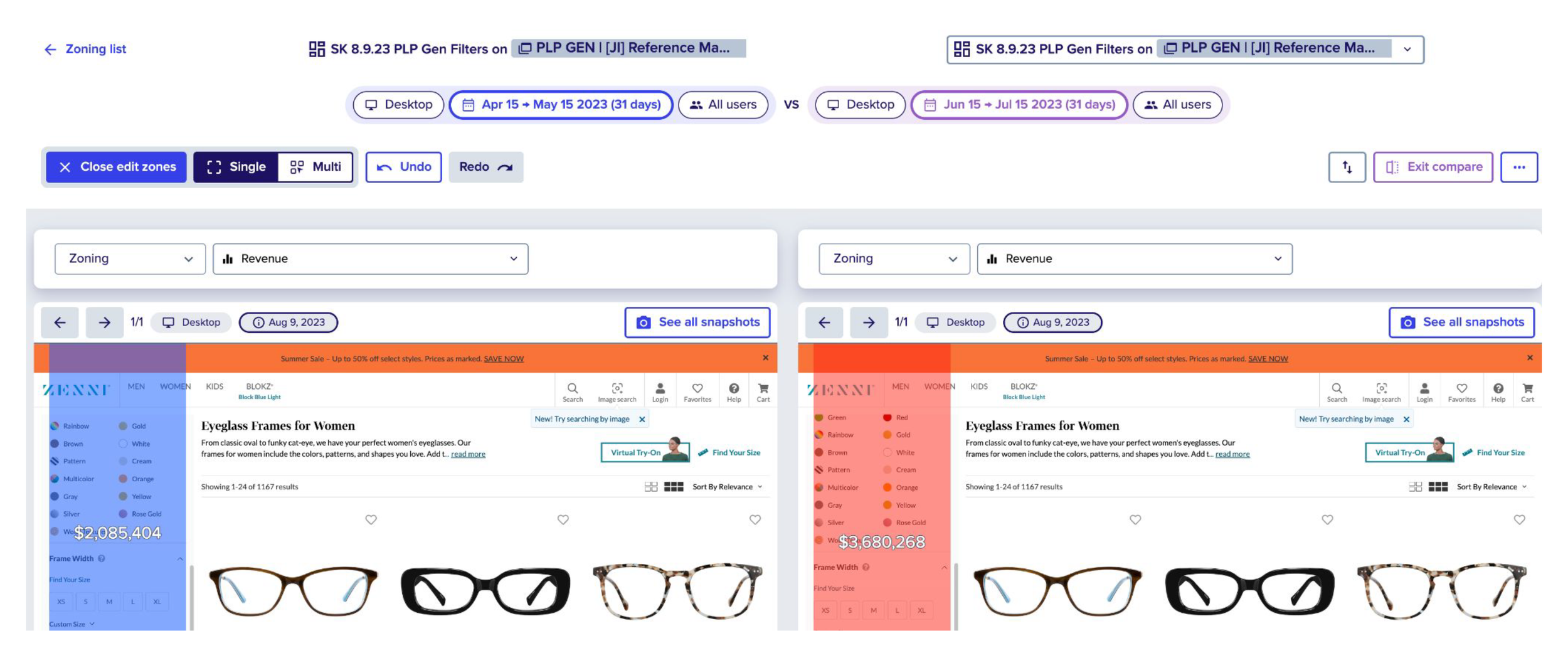
In the first month, revenue increased by $1.6M as users interacted more deeply with the filters.
Long-term results showed annualized revenue growth from $7.2M to $14.3M, effectively doubling initial projections.
The new UI made filters a central conversion driver, transforming them from a secondary utility into a core part of the browsing experience.
Optimizations
By analyzing user needs and shopping behaviors for glasses, we refined the filter hierarchy to improve usability and conversion. Key changes included defaulting the accordion to open, switching filter selections from outlines to checkboxes, redesigning the size filter, and splitting the PD filter into two inputs to accommodate dual PD users. These optimizations enhanced the interaction design, visual hierarchy, and overall UI, leading to a significant increase in conversions.
“Turn filters into a conversion engine—simplifying exploration and doubling annual revenue.”

Before the optimization (blue) After optimization (red)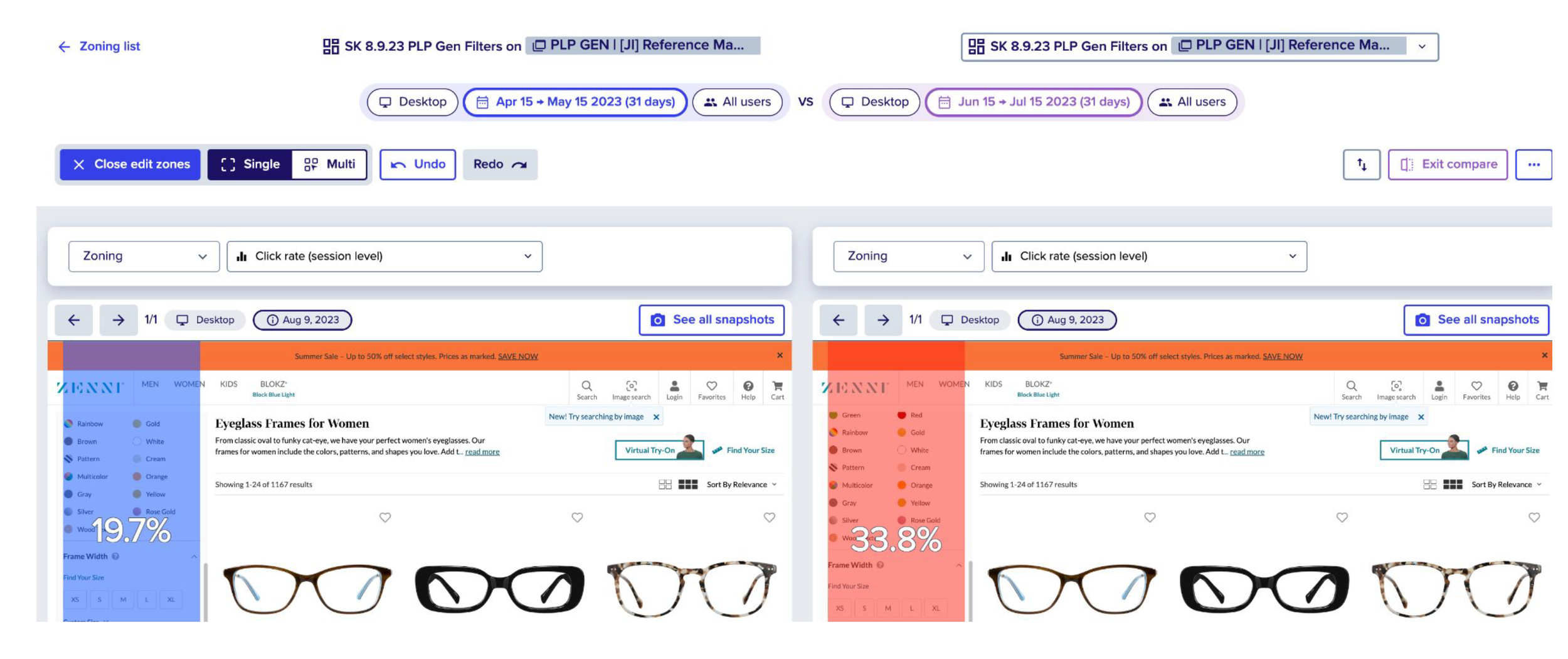
Before the optimization (top line) After optimization (bottom line)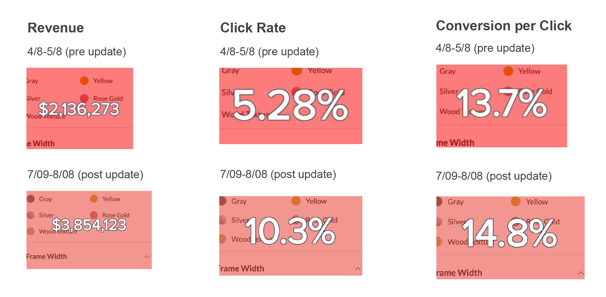
Final Results
Key Learnings
User testing is invaluable for forming hypotheses—but real data tells the truth.
Post-launch behavior revealed that the way users said they prioritize information didn’t fully align with how they actually shopped. This experience reinforced a key design principle: validate insights with live performance metrics, not just usability tests.
Through this redesign, we learned that small, focused improvements in usability can unlock major business impact, strengthening both user confidence and company revenue.